
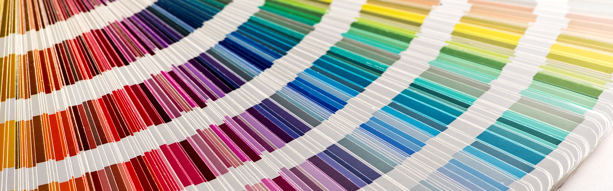
Have you ever seen a colorful logo or design and wondered what makes it pop? There are a lot of elements to consider when working on a design project. Text is, of course, extremely important when it comes to effectively communicating your message, as is the layout and how things are balanced. But when it comes to creating an aesthetically pleasing layout, attracting a potential customer’s attention, or conveying something on a deeper, subconscious level, color is incredibly important. To understand color and it’s effects on your design you first need to learn a bit of color theory.
Color theory is both the science and art of using color. In graphic design it’s the collection of rules and guidelines which designers use to communicate with users through appealing color schemes in visual interfaces. In simple terms: color effects how users feel about the overall design, and how the message is received or in some cases, if it’s received at all.
The Psychology of Color
Color psychology is the study of how color impacts the way we perceive the world around us. Many colors can have a powerful effect on our emotions, as well as how we behave as consumers, so color psychology is widely used in marketing and branding. Designers view color as an important element in their design since color can influence consumers’ emotions and perceptions about goods and services.
Understanding the basics of color psychology can make the use of a certain color palette a deliberate decision to elicit an intentional psychological response, rather than based a personal preference or fleeting fad. A key part of color psychology that is used for graphic design is a consideration of color associations (subconscious associations that people make between colors and abstract things like emotions).
Color Associations
(As is the case with many things, color associations vary from country to country. The following examples are generally Western color associations and don’t necessarily apply to all countries worldwide.)
Red: Power, Passion, Energy, Fearlessness, Strength.
Orange: Amusement, Extroversion, Warmth, Autumn, Energy, Activity.
Yellow: Sunshine, Joy, Youth, Creativity, Energy, Optimism.
Green: Health, Hope, Nature, Freshness, Growth, Prosperity.
Blue: Trust, Loyalty, Dependability, Logic, Security, Peace.
Purple: Royalty, Nobility, Luxury, Power, Ambition, Creativity, Magic.
White: Clarity, Cleanness, Purity, Simplicity, Peace, Minimalism.
Black: Power, Security, Elegance, Authority, Mystery, Sophistication.
The Color Wheel
One tool that artists, designers, and other professionals who work with color use is a color wheel. A color wheel is a visual representation of colors in a color model (a system that uses three or four primary colors to create a larger range of colors), with hues arranged according to wavelength. Color wheels allow color relationships to be represented geometrically, and show the relationship between primary colors, secondary colors and tertiary colors. For my examples I’ll be using a RYB (red, yellow, blue) color model.
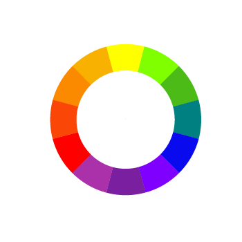

The primary colors in the RYB color model are red, blue and yellow. The primary colors of a color model are mixed to create other colors.
Secondary colors are combinations of two primary colors adjacent to each other on the color wheel. These secondary colors are orange, green and purple.
And finally, tertiary colors are combinations of primary and secondary colors that are adjacent on the color wheel, such as teal, vermillion and violet.
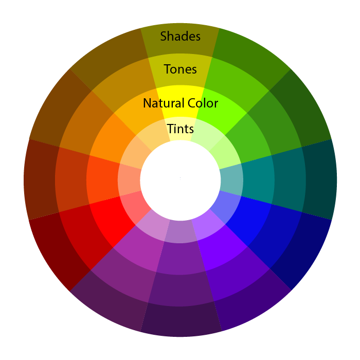
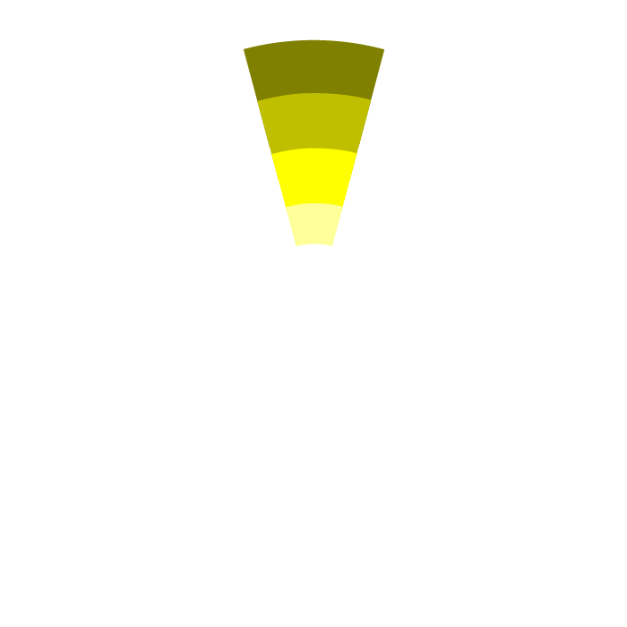
Color wheels come in many different styles. In addition to the natural colors, other colors include tints (colors with white added to lighten them), tones (colors with grey added to dull them), and shades (colors with black added to darken them).
These styles of color wheels are also used to illustrate color schemes, which are used to create color palettes.
Color Schemes
A color scheme is an association of colors based on an organizational system. Basically, it’s a set of colors that work well together to create a unified aesthetic. Color schemes are used to create an emotional impact, evoke a certain mood, communicate a desired message or theme, and to provide balance. They can also be used to differentiate elements in a design, making them easier to read or understand.
The seven major color schemes are monochromatic, complementary, analogous, split complementary, triadic, square, and rectangle (or tetradic).
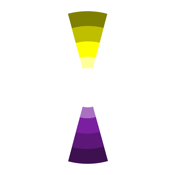
Monochromatic
A monochromatic scheme is one color with all of it’s varying shades, tones, and tints. Though this scheme is low in contrast, designs using it tend to look neat and polished.
This scheme is used often by designers and is suitable for countless purposes from web design through brand development, as long as high contrast isn’t needed between the elements. White space (the areas of a design with no content in it) is an important consideration, and you need to make sure the layout includes enough in order to not appear cluttered.
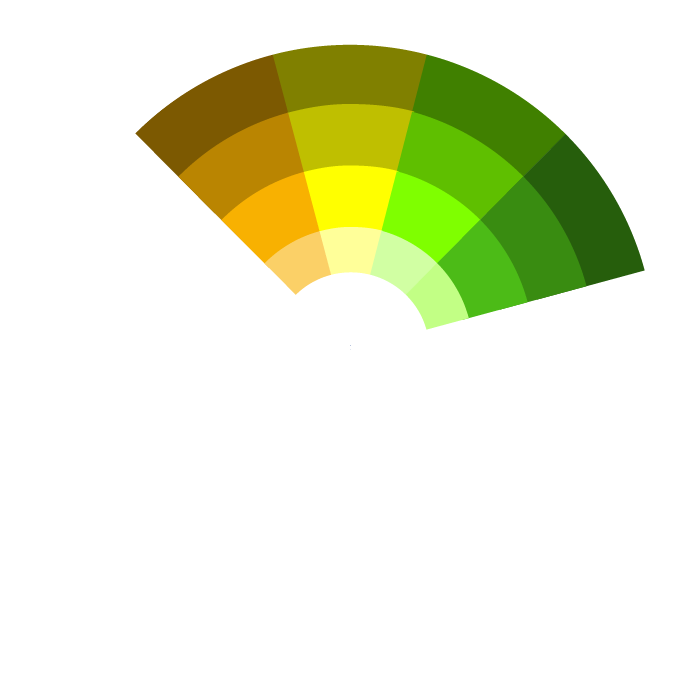
Complementary
A complementary color scheme is based on the use of two colors directly across from each other on the color wheel with their tints and shades. This scheme provides a lot of potential contrast, and care should be given to use it correctly to not create jarring designs. It is best to focus on one color predominately and use the rest for accents.
This scheme is great for any projects where you want to use high contrast colors to grab attention, such as flyers or promotional materials, or even a website landing page.
Analogous
An analogous scheme is three or more colors (including tints, shades and tones) that are beside each other on the color wheel. It is relatively low contrast, but can create soothing, appealing, and satisfying designs.
This scheme is generally not high contrast, but it can be an excellent choice for just about any kind of design if used with appropriate white space. Seasonally themed designs (like Autumnal reds, oranges or yellows), anything where pastels are appropriate, and brand development are three areas you’ll see it often.
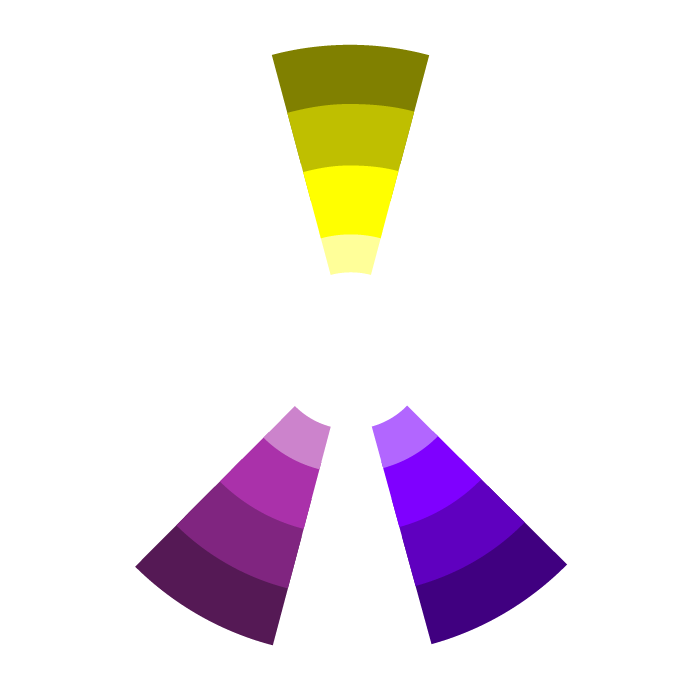
Split Complementary
A split complementary scheme includes one dominant color and at least two colors directly adjacent to the dominant color’s complement. This creates a more nuanced color palette than a complementary color scheme, while still retaining the benefits of contrasting colors. You can use any two colors in the scheme and get great contrast, but that also means it can be tricky to find the right balance between the colors so trial and error may be needed.
This scheme is great for any projects where you want to use high contrast colors to grab attention, such as flyers or promotional materials or even a website landing page.
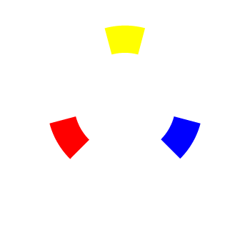
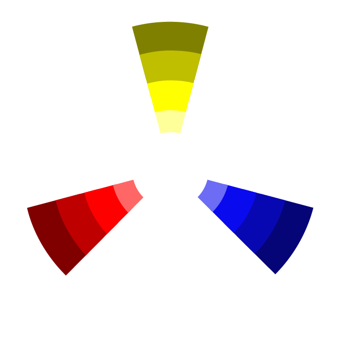
Triadic
A triadic scheme is a combination of three colors that are equally spaced on the color wheel, forming a triangle. Triadic palettes are rich in color and allow visual artists to create contrasting, yet harmonious, designs. The main trick is to balance composition with the help of color hierarchy – let one shade dominate and use the other two as accents.
Triadic schemes can be very high contrast, but be careful not to pick all bold colors. Instead, focus on one main color and balance it with a combination of tints and shades from the other colors to create a nicely balanced design. This scheme is good for advertisements, brochures, and anything that you want to use to catch your audience’s eye.
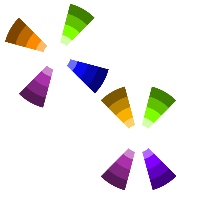
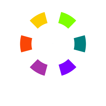
Tetradic (Square or Rectangle)
Also known as a double complementary color scheme, this scheme is comprised of two pairs of complimentary colors that form a square or rectangle on the color wheel. If you mix all the hues in a tetradic palette equally, your design may look unbalanced. For the best results, use one color as your primary color and the other three as accents.
As with Triadic schemes, Tetradic schemes are very high contrast so they are very effective at grabbing the viewers attention. Just make sure to be careful about which tints and shades you choose to avoid creating a jarring design.
Color Palettes
A color palette is a set of up to six colors (rarely more) used together in a design. These colors should include one dominant color, four accent colors, and one standard color for your text (which is usually black or grey). When choosing colors you’ll need to make note of their value. Usually hexadecimal values (For example: #FFFFFF) are used, as they are the easiest to share with your designer due to their universal assigned value and seven digit format.
Once you’ve determined what color scheme you’re going to use it’s time to make a palette. There are many tools to help you with this:
Adobe Color
https://color.adobe.com/create/color-wheel
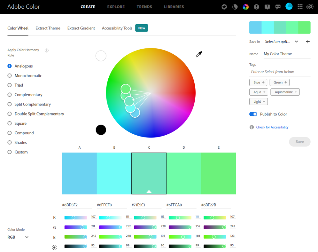
My personal favorite. Free, very easy to use, with a simple interface and adjustable sliders.
Coolors
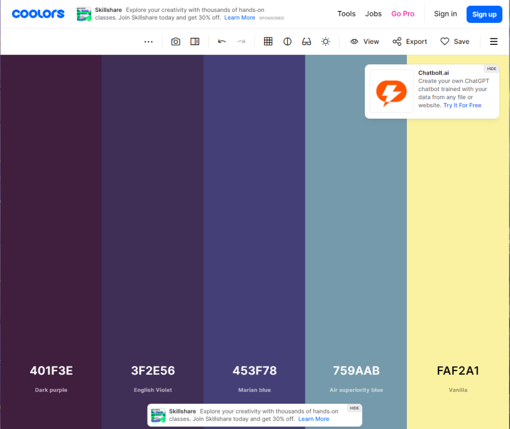
A random palette generator. You can also explore trending palettes as well. Free and premium accounts available.
Canva Palette Generator
https://www.canva.com/colors/color-palette-generator/
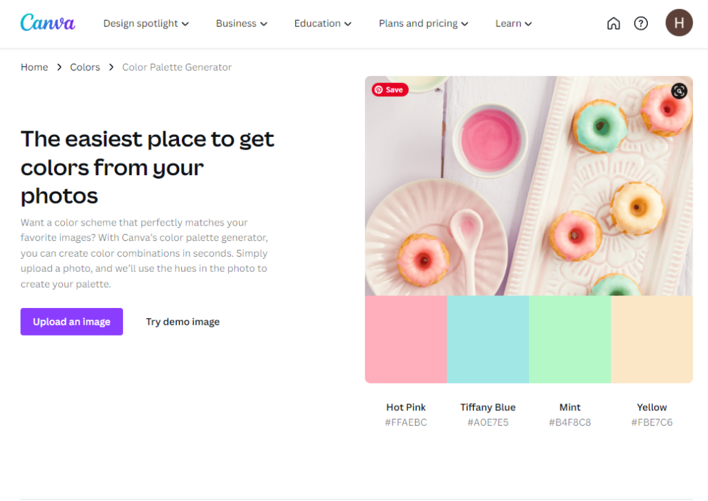
If there’s a graphic or photograph that you want to use to create your palette Canva has got you covered!
And there you have it, a quick guide to creating a color palette. Have any questions? Please feel free to comment below, or reach out to me here if you’d like to chat more. I’m also on Facebook and LinkedIn.
Happy Designing!
