What is a CMS and Which One is Right For You?

Chances are, despite the technical sounding name, you’re already familiar with content management systems. A content management system, or CMS, is a host for content. It’s software that allows users to create their own digital content without needing to learn how to program. Quite simply, content management systems make it possible for anyone to make their own website.

How does a content management system work?

In web development, there’s the frontend and the backend. The frontend, sometimes referred to as the user end, is the portion of software that the end user directly interacts with. This is what a visitor sees in their browser when visiting your website. The backend, on the other hand, is what lies underneath the frontend. It’s the nuts and bolts of an application, the engine that makes the website work and where code is used to alter the appearance and behavior of the website.


Types of content management systems

There are a number of different types of content management systems. The differences between them are defined by the relationship between the frontend and the backend, and how the content is hosted. These include:

Coupled CMS

A coupled CMS, also known as a traditional CMS, is the most common format. It is end-to-end, meaning that the frontend and backend of the software are bundled together with each other. It does require that the user install an application onto their server to be able to use the CMS, though. In addition, a coupled CMS requires dedicated web hosting, which the user is responsible for paying for.

Some popular coupled CMS include:
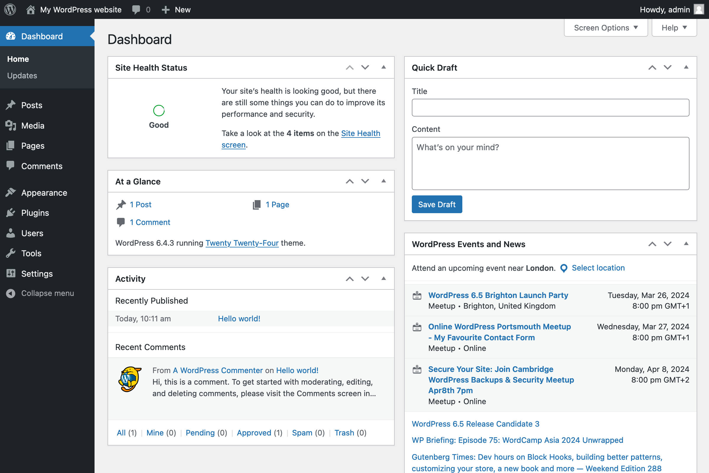
WordPress

WordPress (.org, not .com) is the most popular CMS around, hosting nearly half of websites. And that’s not just as compared to other content management systems; WordPress hosts about 42% of all of the websites on the internet. Clearly, WordPress holds a huge portion of the market, and for good reasons:

  • Accessible to users of all levels of experience.
  • Flexible pricing structure depending on need.
  • A huge marketplace of plugins and themes.

There are a few issues that do come with WordPress, though. The plugin quality can vary significantly, and it lacks customer support, so troubleshooting largely comes down to the end user. In addition, if you have special needs beyond a catchall CMS, WordPress might not quite have what you need. Fortunately, there are plenty of other choices.
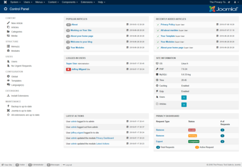
Joomla

Joomla is an open source CMS that is best used for collaboration. It is a popular option, powering about 2% of the internet, which is, despite the unfavorable comparison to WordPress, still a colossal amount of websites. It includes many useful tools:

  • Multilingual features to help communication
  • Two-factor authentication for safety
  • Useful for managing sites with hundreds of subpages

However Joomla isn’t quite as accessible as something like WordPress, and will require a decent amount of technical knowledge. Maintenance can also be rather involved, and as such, Joomla sites are best managed by a team.

Drupal

Drupal, like Joomla, is an open source CMS. Also like Joomla, it is catered specifically to web developers. Drupal does have several distinct advantages:

  • More secure than most other content management systems
  • Better optimization of features
  • Modules built in for expanding the site’s functionality.

All that is balanced against the one major drawback: expertise. Drupal, even more so than Joomla, is designed for professional designers, and doesn’t handhold much. Of course, if you are a professional designer, that’s not a drawback at all, it’s an advantage. But users without a background in development might find it overwhelming to navigate. 

Wix

Many content management systems are either quite complicated or require a good deal of prior knowledge. Wix, on the other hand, is made for new users. Some features that attract such users are:

  • Easy start, just register and get going
  • Very user-friendly platform
  • Inexpensive, with a relatively effective free version

Of course, such ease of use doesn’t necessarily compromise the capability of the platform. Wix is less flexible than many other content management systems, and can be difficult to successfully monetize. But if you have no experience in the field, it’s a great place to start.

SaaS CMS

Software as a service, or SaaS, is an even more straightforward form of CMS. Like a coupled CMS, it is an end-to-end solution. Unlike a coupled CMS, however, SaaS CMS’s are hosted on the cloud. That means that users don’t need to purchase web hosting, nor do they need specific software to access it. 

Many of the most popular coupled CMS companies also offer Saas CMS versions that they host on their own servers, often for low rates. This can be an excellent option for people who want to have blogs or personal websites with a lower commitment.

Decoupled CMS

This is the first form of CMS that is not end-to-end. This is a system where one piece of software manages the front end, a second, separate piece of software manages the backend. In order to get the two to communicate, users need to use an application programming interface, or API. This allows more flexibility and customization, but requires the user to have a good deal more expertise.

Headless CMS

One step further from a decoupled CMS, a headless CMS is just the backend of a system, connecting to a completely custom built front-end application. For obvious reasons, this is the CMS that requires the most work from its users. Not only do they need to design and create their own frontend application, they will also need to connect it to the backend themselves. The tradeoff, however, is a CMS option that allows for almost complete control over a user’s digital content. Copy, images and graphics can be uploaded to the CMS and used on countless websites, easily. This can be really useful for applications like support websites, knowledge bases, or even mobile apps.

Some examples of popular headless CMS are Butter CMS, Sanity and Contentful CMS. 


What are some advantages of using content management systems?

  • CMS’s are very easy to use, especially as compared to web development.
  • They are readily accessible, with no real barriers to use.
  • Provides tools that make the content creation process well organized.
  • Many CMS’s are highly customizable.
  • The wide array of CMS’s available mean that there’s a CMS for nearly any user’s needs.

Are there any drawbacks?

  • Though CMS’s streamline the process a great deal, there is still a learning curve.
  • Managing a website with a CMS can be a time-consuming process.
  • There are always some kinds of limitations, no CMS can do everything.
  • If not carefully maintained with frequent updates, the software may present a security risk. 

That’s just scratching the surface, though. If none of these are the perfect choice, there are thousands of content management systems out there, for whatever specific needs a user may have. Wondering which CMS is right for you? Contact me today!

7 Reasons Print Advertising Isn’t Dead

It’s 2024 and everyone’s online. Thinkpieces, pundits, and your friends all proclaim, no one reads anymore. Print media is dead, long live the internet! But is it?

The truth is, as always, a bit more nuanced than that. Of course, the internet is an always expanding space where more and more people are spending their time. All the same, there are plenty of compelling reasons to advertise in print. Here’s a look at 7 of the most significant:

  1. People Favor Print

It’s possibly the biggest reason that print advertising is still, and probably will always be, relevant. People simply prefer reading physical media. Despite constant technological advancements, looking at a screen still strains the eye more than looking at paper. In addition, studies have shown that consumers have higher response rates to print ads over digital ones. People are more comfortable reading off of a physical piece of print. They’re more likely to respond positively to them. More likely to view your ads positively, and more likely to retain the information. That translates to more effective ads and more potential customers.

  1. Direct Engagement

One of the major advantages of print ads is basically the inverse of one of the major advantages of digital ones. On the internet, ads grab eyeballs. They have to. You go onto a website, and if an ad doesn’t attract your interest the moment you see it, then you dismiss it, and it’s an ineffective ad. With print media, however, consumers grab ads. They are literally holding them. Whether in a newspaper or magazine or even a piece of mail, the consumer has already made the choice to engage with the ad when they start reading it. They are more likely to view the ad positively, opposed to online, where ads are more likely to be seen as an annoyance. In addition, when they’re reading the ad, they’re not going to be distracted by a bunch of other things on the screen. That gives your ad a higher chance of being remembered, and eventually acted on.

  1. Inherent Trust

Anyone can advertise online. It can be done essentially anonymously, from anywhere. There’s no system preventing online ads from being scams, and any system introduced would be quickly circumvented by scammers. People are mostly aware of this by now, and are guarded about online ads. They’re much less likely to be dubious about an ad that they read in a newspaper or magazine. It’s partially what’s known as the “halo effect”. A person is voluntarily reading a newspaper, which means they have trust in that newspaper. They read your ad in said newspaper, and because they trust the newspaper, they inherently trust your ad more than they would otherwise. But even without the halo effect, print ads are more trusted than online ads. Even mailers are generally considered more trustworthy than online ads.

  1.  Direct Targeting

Targeting is an important part of all advertising, but online, more often than not, it’s some form of indirect targeting. An ad is associated with something similar to the thing being advertised, in the hopes that someone who likes that thing will also be attracted to the ad. But unless you’re advertising band merchandise on that band’s website, for instance, it’s extremely rare to be able to directly target the appropriate demo. That’s something you can do with print media. You can directly target one of the most commonly relevant aspects of consumers: location. A restaurant can use menu mailers to let everyone know in their delivery radius that they’re open for business. A local newspaper can announce a grand opening downtown. Print has a unique ability to directly target relevant consumers, something the internet can’t replicate.

  1. Physical Persistence

Once you’re no longer paying for an ad online, that ad is gone. It’s been replaced by the next one. But physical ads persist. Perhaps it’s the aforementioned restaurant mailer gathering dust in the drawer. Maybe it’s an ad in a magazine in a doctor’s waiting room. Or just a newspaper passed from one person to another. Print ads stick around, and as such, they can keep being effective long after you’re done paying for them.

  1. Some People Aren’t Online

Despite what everyone is saying, including me, in the opening to this post, everyone is not online. Even in 2024, there are people who aren’t online much or at all. Older people, for instance, are generally more comfortable with print media. Rural populations, where internet access is often less reliable, are also more dependent on print media. There are large groups of people who simply aren’t online, or at least, aren’t online often. Relying on online advertising alone will miss them altogether.

  1. Mixed Approach is Best

The real biggest reason to advertise in print is that nothing is making you choose. It’s not a matter of which method you should use. The answer is both. Print advertising offers a number of unique advantages, but online advertising does as well. The most effective advertising campaigns are the ones that utilize their resources efficiently. By taking a varied approach, you not only cover more bases, your different forms of advertising can support each other. Someone who sees an ad online that they might have previously dismissed might instead be reminded of that magazine ad they saw, and now that they’re at their computer, this time click through. Or you can use print media with QR codes or websites on them. There’s no reason to limit yourself to just print or just online. Neither one is better, they’re just different. 

From business cards and brochures to packaging and beyond, Blue Moon Design create designs that capture your brand’s essence and resonates with your target audience. We understand the importance of effective communication and attention-grabbing design, and we’ll make sure your print materials stand out from the crowd. Learn more about our offerings and see some of our past designs here, or get in touch today!

The Pros and Cons of DIY Graphic Design

With all of the advancements in technology in recent years, it’s never been easier to get into doing your own graphic design. The tools, techniques, and technology are all out there for the enterprising individual to find, if they choose to seek it out. Anyone who runs a website or operates a small business might want to at least consider designing their own graphics. That said, there are also some strong reasons why it might be better to simply hire a professional. Today we’ll examine some of the reasons both for and against doing your own graphic design.

Cost

The most obvious advantage of doing your own graphic design is pretty immediately apparent; it’s free! Or at least, it can be free; the software that you’ll need to create your own graphics can be pricey at the top end, but freeware also exists to allow amateurs to try their hand without a significant investment. Regardless of what software you use, doing the work yourself will still be significantly less expensive than hiring a graphic designer.

Control

Working with a graphic designer is always a process with a good deal of ebb and flow. You have to tell the designer what you want them to make, but then, there’s no more input you can have in the process until they bring a product to you, one that may or may not resemble what you’d hoped it would become. When you’re doing your own graphic design, you have a much more intimate level of control; as you guide every step of the process, you have no one to blame, or to praise, than yourself.

Clarity

You want to have this graphic made in the first place in order to express an idea to your audience, but in order to get that idea made into something real, you first need to express that idea to your graphic designer. Believe it or not, that communication can be one of the most difficult parts of working with a graphic designer; sometimes the designer you’re working with just can’t seem to understand your vision, or perhaps you yourself are struggling with how to describe the idea that you’ve had. Whatever it may be, there are times when bringing your particular vision to life requires cutting out the middleman and making it yourself. 

Fun

Creative outlets of all kinds can be enriching and invigorating processes for many people. Others find artistic creativity to be overwhelming or paralyzing. You can never know what kind of artistic pursuit you might find fun and relaxing until you try; some people paint, some journal, some dance, and some, yes, creative visual art. Because at the end of the day, that’s what graphic design is, a facet of the visual arts. So whether you’re an old hand or a first timer, try out making your own graphics. You might find that you actually enjoy it. 

Efficiency

As mentioned above, doing your own graphic design can be a huge cost-saver, as it’s hard to beat “free” for a price. However, that does come with a pretty significant asterisk. Depending on how quickly you’re able to pick up graphic design, how efficiently you’re able to use the tools that you’ve procured, and how much other work you have to do to maintain your business, it’s possible to lose money even without paying a graphic designer. Because we all have a limited amount of time in the day, it’s no good spending a week designing an awesome graphic all day if you have other responsibilities that get neglected in that time. And one of the best things you get when hiring a graphic designer is experience; they’ve done this sort of thing countless times before, so the tools that you spend minutes looking for they reflexively use without thinking about. A task that takes an amateur a full week might take an experienced graphic designer only a few hours, just because they know what they’re doing.

Professionalism

In that same vein, graphic designers bring that level of experience to the whole task ahead of them. Figuring out what software to use won’t even be a factor for them; they will already have a suite of tools that they’re accustomed to using. More importantly, they will know about a whole host of pitfalls that amateur designers might not know about. Designers already know if certain fonts are frowned upon or if particular layouts are confusing for the average reader, making sure that your final product comes across polished and professional.

Collaboration

Humans are a societal species, and even the smartest among us can’t think of everything all the time. When you hire a graphic designer, in a sense you’re hiring a partner. You will talk through exactly what you want to have designed, how you envision it, how you want it to make customers who see it feel. But your designer isn’t just an AI bot, taking in your requests and spitting out a result. A good designer will talk through the project with you, and will often point out things that you would never have thought of on your own. It’s a good idea to listen to what they have to say; even if you end up going with your initial plan, that collaborative expertise is a great way to strengthen your project. Two heads are better than one, as they say.

Quality

Graphic designers have spent a great deal of time honing their craft. They have a unique blending of experience, combining marketing with visual arts, often having gone to school for one or both of them, in addition to spending years in the industry constantly honing their craft. Put simply, many graphic designers are just plain good artists, and when you hire them, that artistic talent is brought to your project. Unless you happen to be a great artist yourself, it’s unlikely that your final product, full of passion it may be, will be quite as aesthetically appealing as what a professional can create.

So there it is. Is it better to hire a graphic designer or to do it yourself? That entirely depends on you. How much time do you have, how much artistic talent do you have, what is the idea that you want to bring to life? Perhaps you want to mostly make your own graphics, hiring a designer for certain special projects. Maybe the idea of having a graphic designer on retainer would be a good way to grow your business. Whatever the answer is, it will depend most on you, your skills, inclinations, and needs.

Top Ten Graphic Design Trends 2024

To be an impressive and effective graphic designer requires keeping up with the ever shifting trends. More than perhaps any other artistic medium, the cutting edge of graphic design is always changing, always pushing forward. Even if laypeople can’t necessarily pinpoint what makes a particular graphic feel aged, it still might come across as out of touch. That’s why it’s so important to know what is popular in the field of graphic design. Here are ten of the top graphic design trends in 2024.

AI enhancement

Currently, there is a firestorm of debate about the professional use of AI. Some people love it, others hate it, it’s been the center of numerous legal battles and surely countless more will follow. One way or another, though, AI is here to stay, and many graphic designers are learning to harness AI to help them.

Obviously, you can’t just type a prompt into an image generator and then use that as your graphic. But there are plenty of other ways that AI can enhance your work, from helping you brainstorm ideas to assisting with image touch-ups. More and more as we step into the future, AI is going to have an impact on every artistic field, including graphic design.

Pixel Art

Retro is always in, but our idea of what retro is will always be a moving target. A common theory behind this social phenomenon is generational, as the children of twenty and thirty years ago step into decision-making roles in the prime adult demographic, whatever they grew up with becomes popular again.

It’s why the 80s gave us so many 50s movies, just like we have Stranger Things reflecting the same thing now, and in the design field, it’s why pixels are making a huge comeback. In the 80s and 90s, large square pixels were the only options to create images using limited disk space; now, they evoke comfortable feelings of getting up on Saturday morning to play video games on a clunky console.

Inclusion

Even if retro themed designs are always popular, in one fashion or another, if you take a look at some actual graphics from generations past, you can easily see that they don’t represent the world as it is now, or even as it was then. The people pictured in older graphics are almost always white, almost always heteronormative, almost always ascribing to gender roles; basically portrayed in ways that were “acceptable”.

As we all know, such a way of looking at the world isn’t acceptable now, and shouldn’t have been then. Instead, graphic designers in 2024 strive to use their art to portray the world as it actually is, with every ethnicity, sexuality, gender, age, and level of ability represented. It’s more compassionate, more perceptive, and above all, more accurate.

Maximalism

Minimalism is a graphic design mainstay that’s not likely to go anywhere anytime soon, but wherever there’s culture, there evolves a counter to that culture.

Almost as a deliberate response to simple graphics that some new designers perceive as boring, maximalism is one of the fastest growing graphical movements in 2024.

Defined by bright colors, big letters, and using as much space as possible, maximalist designs are splashy, eye-catching, and demand the audience’s attention.

Expressive Typography

Graphic design is, at its very core, using images to express more than words could do on their own. But that doesn’t mean that words are never used in graphics; of course they are!

Oftentimes, the words themselves are worked into the graphics in ways that supplement both. That’s the philosophy behind expressive typography: rather than having graphics and words working alongside each other, expressive typography turns the words themselves into a canvas.

In 2024, designers are pushing the envelope more and more into how artistically they can render words in a way that supports the central design.

Gradients

Utilizing gradients, the slow shift from one color to another, in interesting ways, has been at the forefront of graphic design for several years now, and 2024 is no different in that regard.

Graphic designers have been exploring different methods for creating eye-popping visuals, whether it’s through unusual color combinations, combining three or more different colors for interesting effects, or one particularly interesting new gradient trend, heatmapping.

These complex swirls of color reminiscent of topographical maps or social science maps have an incredible capability for creating visually interesting designs full of depth and dimension.

Nature Aesthetic

With the looming threat of climate change and ecological sustainability at the forefront of everyone’s minds, it’s no surprise a return to nature aesthetics is a big trend in 2024.

This movement uses colors and visuals that evoke feelings of nature, the lush greens and deep browns of the forest, the sandy tan and bright blue of the beach, bright colors that are grounded in fruits and flowers. In some instances, if the option is there, some designers are even opting to use more natural materials in their products.

The technological and social push forward can feel exhausting, and the world around us can seem more and more technical and impersonal, so this drive towards natural aesthetics is one that resonates with a lot of people right now.

Scrapbooking

Just like that nature aesthetic, scrapbooking style graphics engender a sense of verisimilitude that can feel extremely powerful.

This style is deliberately haphazard, with polaroid style pictures and big balloon letters, perhaps some doodles in the margin, all in an effort to feel humanizing. It taps into a similar feeling as the prominent rise of pixel art, as scrapbooking itself brings a sense of nostalgia to many of us.

With so much of the world around us growing more technical and more impersonal, imparting a bit of your humanity into your graphics can go a long way in reaching your audience.

Vibrant Contrast

Bright, eye-catching colors are more popular than ever; possibly as our attention spans get shorter and shorter, the graphics that designers use to catch our attention get brighter and more vibrant. But there’s more to it than simply catching the eye, you want your message to be clear and impactful.

That’s where high contrast designs come in, using the very colors themselves to draw your audience’s eyes where they need to go. An extremely vibrant design with clear, high contrast portrays a sense of energy and of power.

Beyond that, the clear contrast makes graphics more accessible to those who might have visual impairments.

3D

3D either looks great, or it looks terrible. There’s very little in between. Numerous times in the past, 3D has trended in various industries, including graphic design, but before, there’s been a clear delineation between the haves and the have-nots, as those with the right technology and know-how are able to make graphics that truly pop, while the vast majority make easily identifiable knockoffs, and the trend dies away.

This time, however, is different for one key reason: the technology required to make great looking 3D images is now widely available, and more and more designers are starting to realize that, done properly, 3D graphics look great.

Expect to see more and more 3D graphics in the coming years as the gates preventing most designers from creating them properly have come tumbling down.

Ethical Marketing

Ethical marketing refers to the practice of promoting products or services in a manner that is honest, transparent, and respectful of consumers and societal values. This type of marketing aims to build long-term relationships with customers based on trust, integrity, and mutual benefit. Ethical marketers avoid deceptive tactics, such as misleading advertising or false claims about a product’s benefits, and instead prioritize accurate and truthful communication about products and services. They also take into consideration the wider impacts of their marketing activities, such as environmental sustainability or social responsibility. By prioritizing ethical marketing, companies can enhance their reputation, build customer loyalty, and foster a positive impact on society, while also promoting their products and services in a responsible and respectful manner.

  • For businesses: Ethical marketing can build trust and loyalty with consumers, which can lead to increased sales and profits. It can also help businesses attract and retain top talent, as more and more people are looking to work for companies that share their values.
  • For consumers: Ethical marketing can help consumers make informed choices about the products and services they buy. It can also help protect them from fraud and deception.
  • For society: Ethical marketing can help create a more just and equitable society. It can promote sustainability and environmental protection, and it can help to reduce social inequality.

Here are some examples of ethical marketing practices:

  • Using clear and concise language: Ethical marketers use clear and concise language in their marketing materials. They avoid using jargon or technical terms that consumers may not understand.
  • Disclosing all relevant information: Ethical marketers disclose all relevant information about their products and services, including the ingredients, nutritional information, and environmental impact.
  • Avoiding misleading or deceptive practices: Ethical marketers avoid misleading or deceptive practices, such as false advertising and bait-and-switch tactics.
  • Respecting consumers’ privacy: Ethical marketers respect consumers’ privacy. They do not collect or use personal information without the consumer’s consent.
  • Promoting sustainable practices: Ethical marketers promote sustainable practices in their marketing activities. They use recycled materials, reduce their carbon footprint, and support fair trade practices.
  • Raising awareness of social and environmental issues: Ethical marketers use their marketing platform to raise awareness of social and environmental issues. They support causes that make a positive impact on the world.

Of course, there are also some challenges associated with ethical marketing. It can be more expensive to produce and market products in an ethical way. It can also be more difficult to compete with businesses that engage in unethical practices. However, the long-term benefits of ethical marketing make it a worthwhile investment for businesses that are committed to doing the right thing.

Here are some tips for businesses that want to engage in ethical marketing:

  • Be honest and transparent: Be honest and transparent about your products and services. Do not make false or misleading claims, and disclose all relevant information to consumers.
  • Respect consumers: Respect the rights of consumers. Do not use manipulative or coercive tactics, and do not exploit consumers’ vulnerabilities.
  • Consider the environmental and social impacts of your marketing activities: Strive to minimize your impact on the planet and to promote sustainable practices.
  • Be socially responsible: Use your marketing platform to raise awareness of social and environmental issues, and support causes that make a positive impact on the world.

Ethical marketing is not always easy, but it is important. By following the principles of ethical marketing, businesses can build trust and loyalty with consumers, attract and retain top talent, improve their reputation, and make a positive impact on the world.

<- Back to Blog

5 Signs It’s Time For a Rebrand

Branding is critical to business. It is your identity, sets you apart from the competition and presents a memorable impression. This recognition increases company value, provides insight, sets expectations, and makes acquiring new customers easier.

But as the years go by, design trends change, and if your branding doesn’t keep up, you may start to lose customers. Even the most successful businesses need to rebrand at some point, but it’s not a decision to make lightly. After all, rebranding is an investment of both time and resources.

In this post, I’ll explain what a rebrand is, why a rebrand is so important for your business, and some of the top signs it’s time to rebrand.

What is a rebrand?

A rebrand is the process of changing a company or organizations initial brand. It can be as subtle as making small updates to your logo, color palette and fonts. It can also include extensive changes, such as completely new logo design or even a company name change. The level of rebranding needed will depend on a lot of factors, such as how long it’s been since the brand was last updated or the reason behind the rebranding in the first place.

Why rebrand?

Companies evolve, and often, to stay competitive, they must evolve their brand and branding. Even the most successful and big-name brands such as Pepsi, Nike, and Burger King update their brand on a regular basis in order to stay relevant.

Rebranding helps to ensure that your brand remains strong: that it has a consistent and recognizable identity. A strong brand makes it more likely your customers will choose your product or service over the competition. Strong brands attract more customers, at a lower cost per acquisition, who are willing to pay more, and will buy more often.

So now that you know what a rebrand is, and why it’s important, when do you know the time is right? Let’s go over the biggest signs.

Signs that it’s time for a rebrand:

1. The style is outdated.

Unfortunately, even the strongest brands have a shelf life. Markets evolve, the priorities of customers change, and design trends come and go. And so, a brand is generally only fresh and relevant for five to ten years.

If it’s been a long time since your brand has been refreshed, or if your logo has more in common with logos from decades past rather than modern logos, it might be time for a consultation with a designer.

The evolution of Coca-Cola's logo over the years, as a chart.

2. You want to target a more specific audience

Trying to market to everyone is the perfect way to fail. Similarly, if your brand isn’t speaking directly to your target audience, then you also risk failing. In such cases, you need to rebrand to ensure that your brand identity resonates with your audience.

Rebrands done to target a specific audience often turn a neutral-looking brand into something a lot more evocative and relatable, making it easier to effectively communicate your value proposition to your target audience.

A person is shown holding a lightbulb. Digital icons and a target are superimposed over the picture.

3. You’re struggling to stand out from the competition

Another way to know when to rebrand is when your brand starts looking like every other brand. Branding is all about competitive differentiation. Competitive differentiation is how a company’s product or service is distinct from what its competitors offer.

A strong brand will involve a design that is themed appropriately for the target audience, while including unique elements like creative typography or an appealing, memorable logo. You don’t want to stick out like a sore thumb: you want to stand out in the crowd.

A group of little wooden figures, all white except for a red one in the center that stands out.

4. Your business model or strategy has changed

You can’t always predict the outside forces that will compel changes to your business. But when your business model or strategy changes, so must your brand. The way your company is perceived by those it serves should always align with the way it operates and what it offers.

Any extensive rebrand should begin with solidifying your company’s purpose, vision, mission, and values. If your brand doesn’t reflect the focus or strategic direction of your business, rebranding your company is critical. You don’t want to send mixed messages about who you are or what you do to your target audience.

Hexagonal tiles are shown, with icons like a bag of money and a shopping cart, put together to imply they're parts of a bigger business model.

5. You just don’t like your current brand style

If you feel like your website needs a “New website coming soon!” disclaimer, or you cringe when you go to give someone your business card it might be time for a rebrand. Your brand is your professional identity, and it should never make you feel embarrassed.

Sometimes all it takes is a simple palette change, an updated logo, or a different font choice to make a difference in how you perceive your brand. But if you’re unhappy with your current brand it’s always worth a consultation to chat with a professional about your options.

A man is shown sitting in front of a computer, head leaning against one of his hands. He looks unhappy.

Now that you’ve considered these factors that signal it’s time to rebrand your business, remember to keep them in mind and stay conscious of your brand moving forward. Rebranding can be difficult for your business, but it’s worth the effort when done correctly.

And if you find yourself wondering if it’s the right time for your business to rebrand, get in touch for a free consultation here. I specialize in brand development/rebranding and would love to help!


<- Back to Blog

Color Theory 101: Using Color Schemes to Pick the Best Palette for your Design

Have you ever seen a colorful logo or design and wondered what makes it pop? There are a lot of elements to consider when working on a design project. Text is, of course, extremely important when it comes to effectively communicating your message, as is the layout and how things are balanced. But when it comes to creating an aesthetically pleasing layout, attracting a potential customer’s attention, or conveying something on a deeper, subconscious level, color is incredibly important. To understand color and it’s effects on your design you first need to learn a bit of color theory.

Color theory is both the science and art of using color. In graphic design it’s the collection of rules and guidelines which designers use to communicate with users through appealing color schemes in visual interfaces. In simple terms: color effects how users feel about the overall design, and how the message is received or in some cases, if it’s received at all.

The Psychology of Color

Color psychology is the study of how color impacts the way we perceive the world around us. Many colors can have a powerful effect on our emotions, as well as how we behave as consumers, so color psychology is widely used in marketing and branding. Designers view color as an important element in their design since color can influence consumers’ emotions and perceptions about goods and services.

Understanding the basics of color psychology can make the use of a certain color palette a deliberate decision to elicit an intentional psychological response, rather than based a personal preference or fleeting fad. A key part of color psychology that is used for graphic design is a consideration of color associations (subconscious associations that people make between colors and abstract things like emotions).

Color Associations

(As is the case with many things, color associations vary from country to country. The following examples are generally Western color associations and don’t necessarily apply to all countries worldwide.)

Red: Power, Passion, Energy, Fearlessness, Strength.

Orange: Amusement, Extroversion, Warmth, Autumn, Energy, Activity.

Yellow: Sunshine, Joy, Youth, Creativity, Energy, Optimism.

Green: Health, Hope, Nature, Freshness, Growth, Prosperity.

Blue: Trust, Loyalty, Dependability, Logic, Security, Peace.

Purple: Royalty, Nobility, Luxury, Power, Ambition, Creativity, Magic.

White: Clarity, Cleanness, Purity, Simplicity, Peace, Minimalism.

Black: Power, Security, Elegance, Authority, Mystery, Sophistication.

The Color Wheel

One tool that artists, designers, and other professionals who work with color use is a color wheel. A color wheel is a visual representation of colors in a color model (a system that uses three or four primary colors to create a larger range of colors), with hues arranged according to wavelength. Color wheels allow color relationships to be represented geometrically, and show the relationship between primary colors, secondary colors and tertiary colors. For my examples I’ll be using a RYB (red, yellow, blue) color model.

The primary colors in the RYB color model are red, blue and yellow. The primary colors of a color model are mixed to create other colors.

Secondary colors are combinations of two primary colors adjacent to each other on the color wheel. These secondary colors are orange, green and purple.

And finally, tertiary colors are combinations of primary and secondary colors that are adjacent on the color wheel, such as teal, vermillion and violet.

Color wheels come in many different styles. In addition to the natural colors, other colors include tints (colors with white added to lighten them), tones (colors with grey added to dull them), and shades (colors with black added to darken them).

These styles of color wheels are also used to illustrate color schemes, which are used to create color palettes.

Color Schemes

A color scheme is an association of colors based on an organizational system. Basically, it’s a set of colors that work well together to create a unified aesthetic. Color schemes are used to create an emotional impact, evoke a certain mood, communicate a desired message or theme, and to provide balance. They can also be used to differentiate elements in a design, making them easier to read or understand.

The seven major color schemes are monochromatic, complementary, analogous, split complementary, triadic, square, and rectangle (or tetradic).

Monochromatic

A monochromatic scheme is one color with all of it’s varying shades, tones, and tints. Though this scheme is low in contrast, designs using it tend to look neat and polished.

This scheme is used often by designers and is suitable for countless purposes from web design through brand development, as long as high contrast isn’t needed between the elements. White space (the areas of a design with no content in it) is an important consideration, and you need to make sure the layout includes enough in order to not appear cluttered.

Complementary

A complementary color scheme is based on the use of two colors directly across from each other on the color wheel with their tints and shades. This scheme provides a lot of potential contrast, and care should be given to use it correctly to not create jarring designs. It is best to focus on one color predominately and use the rest for accents.

This scheme is great for any projects where you want to use high contrast colors to grab attention, such as flyers or promotional materials, or even a website landing page.

Analogous

An analogous scheme is three or more colors (including tints, shades and tones) that are beside each other on the color wheel. It is relatively low contrast, but can create soothing, appealing, and satisfying designs.

This scheme is generally not high contrast, but it can be an excellent choice for just about any kind of design if used with appropriate white space. Seasonally themed designs (like Autumnal reds, oranges or yellows), anything where pastels are appropriate, and brand development are three areas you’ll see it often.

Split Complementary

A split complementary scheme includes one dominant color and at least two colors directly adjacent to the dominant color’s complement. This creates a more nuanced color palette than a complementary color scheme, while still retaining the benefits of contrasting colors. You can use any two colors in the scheme and get great contrast, but that also means it can be tricky to find the right balance between the colors so trial and error may be needed.

This scheme is great for any projects where you want to use high contrast colors to grab attention, such as flyers or promotional materials or even a website landing page.

Triadic

A triadic scheme is a combination of three colors that are equally spaced on the color wheel, forming a triangle. Triadic palettes are rich in color and allow visual artists to create contrasting, yet harmonious, designs. The main trick is to balance composition with the help of color hierarchy – let one shade dominate and use the other two as accents.

Triadic schemes can be very high contrast, but be careful not to pick all bold colors. Instead, focus on one main color and balance it with a combination of tints and shades from the other colors to create a nicely balanced design. This scheme is good for advertisements, brochures, and anything that you want to use to catch your audience’s eye.

Tetradic (Square or Rectangle)

Also known as a double complementary color scheme, this scheme is comprised of two pairs of complimentary colors that form a square or rectangle on the color wheel. If you mix all the hues in a tetradic palette equally, your design may look unbalanced. For the best results, use one color as your primary color and the other three as accents.

As with Triadic schemes, Tetradic schemes are very high contrast so they are very effective at grabbing the viewers attention. Just make sure to be careful about which tints and shades you choose to avoid creating a jarring design.

Color Palettes

A color palette is a set of up to six colors (rarely more) used together in a design. These colors should include one dominant color, four accent colors, and one standard color for your text (which is usually black or grey). When choosing colors you’ll need to make note of their value. Usually hexadecimal values (For example: #FFFFFF) are used, as they are the easiest to share with your designer due to their universal assigned value and seven digit format.

Once you’ve determined what color scheme you’re going to use it’s time to make a palette. There are many tools to help you with this:

Adobe Color

https://color.adobe.com/create/color-wheel

My personal favorite. Free, very easy to use, with a simple interface and adjustable sliders.

Coolors

https://coolors.co/

A random palette generator. You can also explore trending palettes as well. Free and premium accounts available.

Canva Palette Generator

https://www.canva.com/colors/color-palette-generator/

If there’s a graphic or photograph that you want to use to create your palette Canva has got you covered!

And there you have it, a quick guide to creating a color palette. Have any questions? Please feel free to comment below, or reach out to me here if you’d like to chat more. I’m also on Facebook and LinkedIn.

Happy Designing!

<- Back to Blog